CRAFTING ALL THINGS VISUAL
for Arts & Cultural affiliated projects
A.P./Studio is also a visual communication division for creative consultancy, design, direction, branding, content, artwork, spatial concepts, production and everything in between.
-
Always with a keen eye for well-crafted things, content based branding, design systems and bold aesthetics the past decade and a half our team collaborated with numerous organisations, brands and (cultural) clients on a strategic, creative, productional and artistic level to define their contemporary visual and cultural communication.
The visual communication division is led by A.P./Studio and operates as a one-stop-shop for your creeative project.
-
Art & Culture
PLUS-ONE Gallery, Studio Brussel, Handelsbeurs Concertzaal Gent, Universal Records, Sharing Art BV, NEWS Records, KlaraFestival, Gallery Sofie Van de Velde, Festival van Vlaanderen Brussel, Industriemuseum Gent, Design Museum Gent, Caoutchou Records, Kiki Hitomi, Designregio Kortrijk, Wonder Kortrijk, Kamping Kitsch Club festival, Gentse Feesten.Corporates & organisations
Stad Kortrijk, Stad Gent, CirQ vzw, Artsen Zonder Grenzen, 11.11.11, Vlaamse Jeugdraad, Upgrade Estate, Duvel Moortgat, Warner Bros Benelux, DVV Verzekeringen, Telenet, Deliveroo, Liantis, Eandis, Coca-Cola, Adobe, Cronos Groep.Agencies
De Vloer, Walkie Talkie, MMBSY, Happiness Brussel, We Make You Happy, AKA De Mensen, The Breakfast Club, Wasserman Agency, Milk and Cookies, Oona agency, Too Many Agencies.
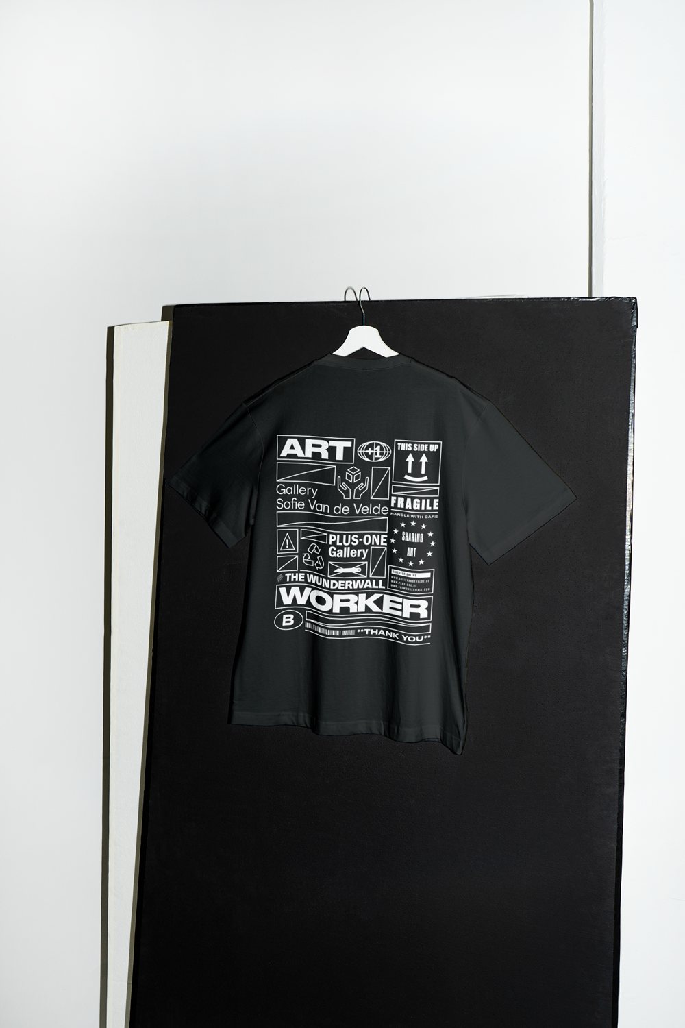
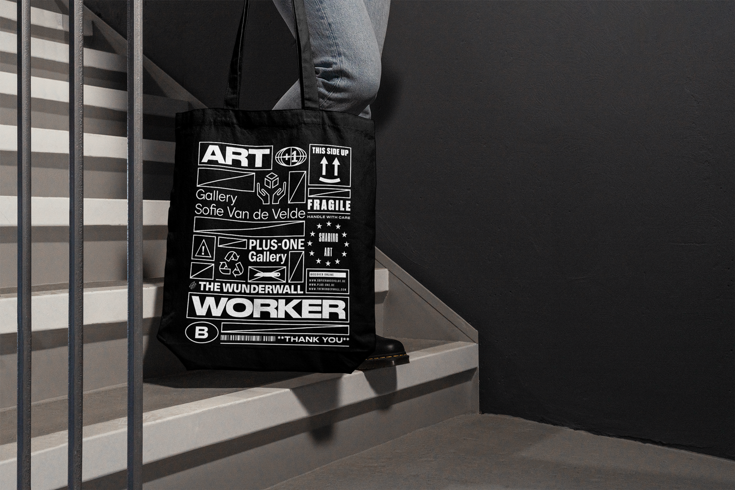
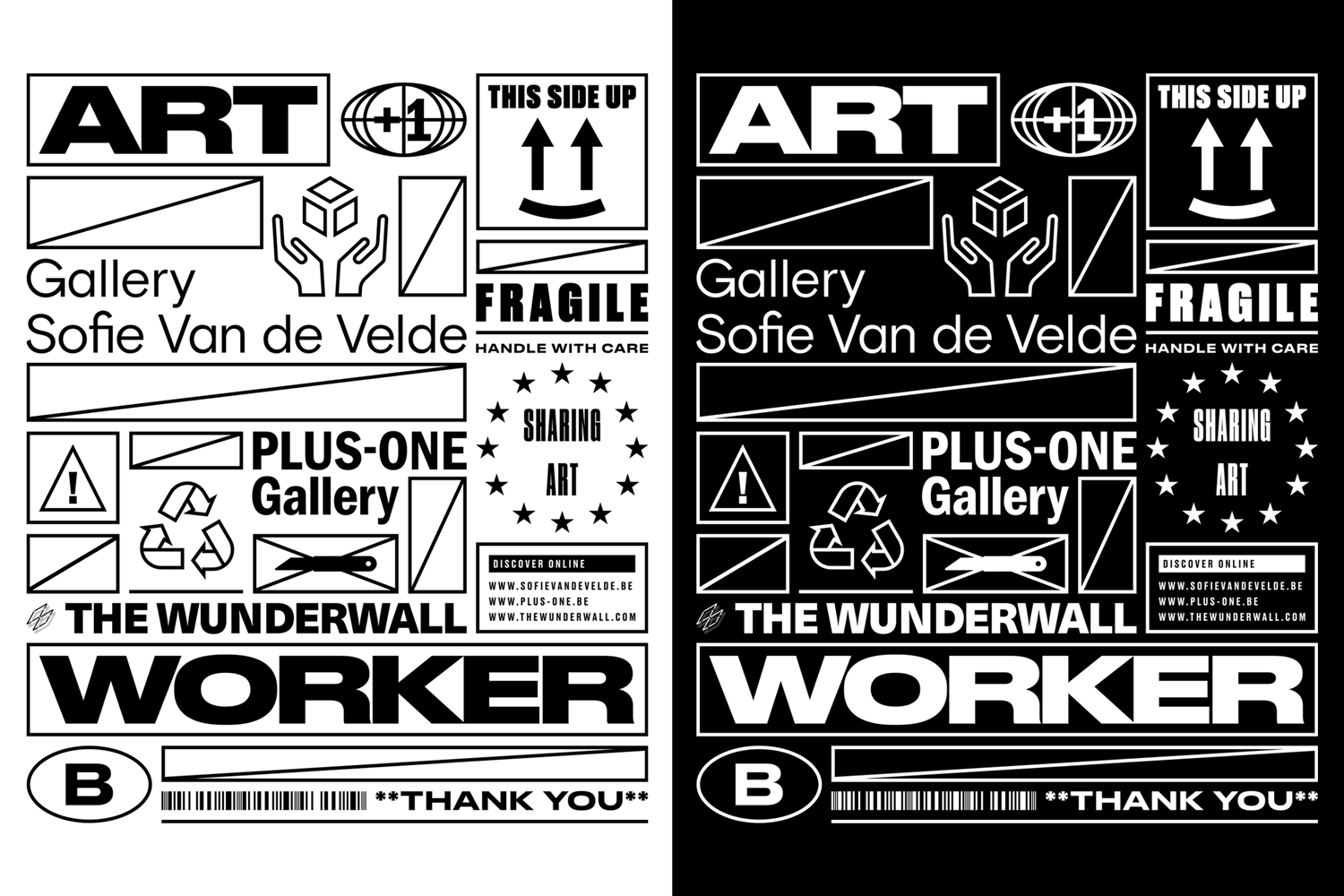
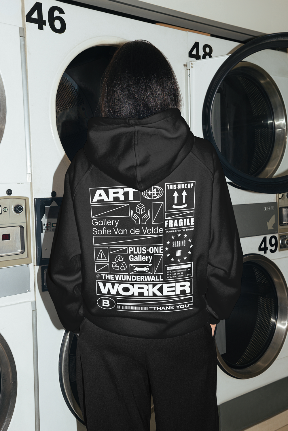
Client: Sharing Art BV
Project: Branding Art Workers clothing
Tags: Advisory, Art direction & graphic design
-
Behind the scenes, PLUS-ONE Gallery, Gallery Sofie Van de Velde and THE WUNDRWALL share some resources and services, including the storage, delivery and installation of art. This joint venture goes by the name ‘Sharing Art’.
Inspired by labels and icons we find in logistical context, A.P./Studio developed a modular and recognisable micro identity that fits all the labels their DNA and matching the actual activities of the art handlers.
The merchandising is created to increase the visibility of their art handlers during delivery and installations.
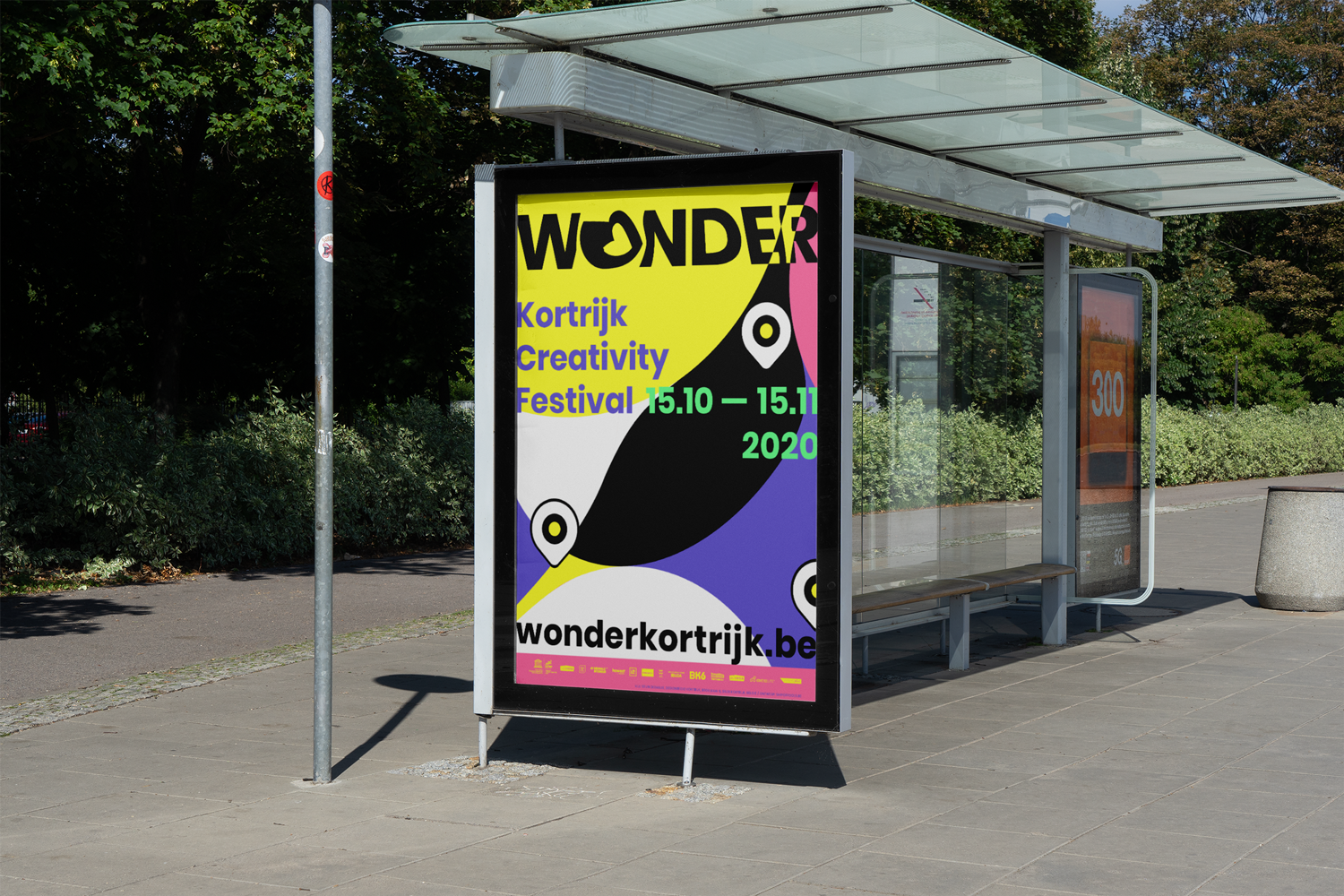
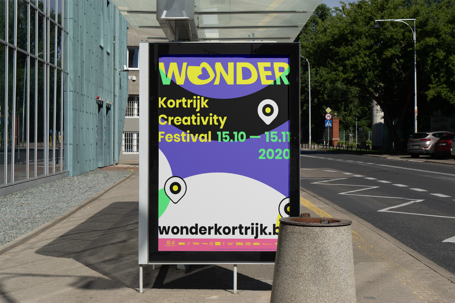
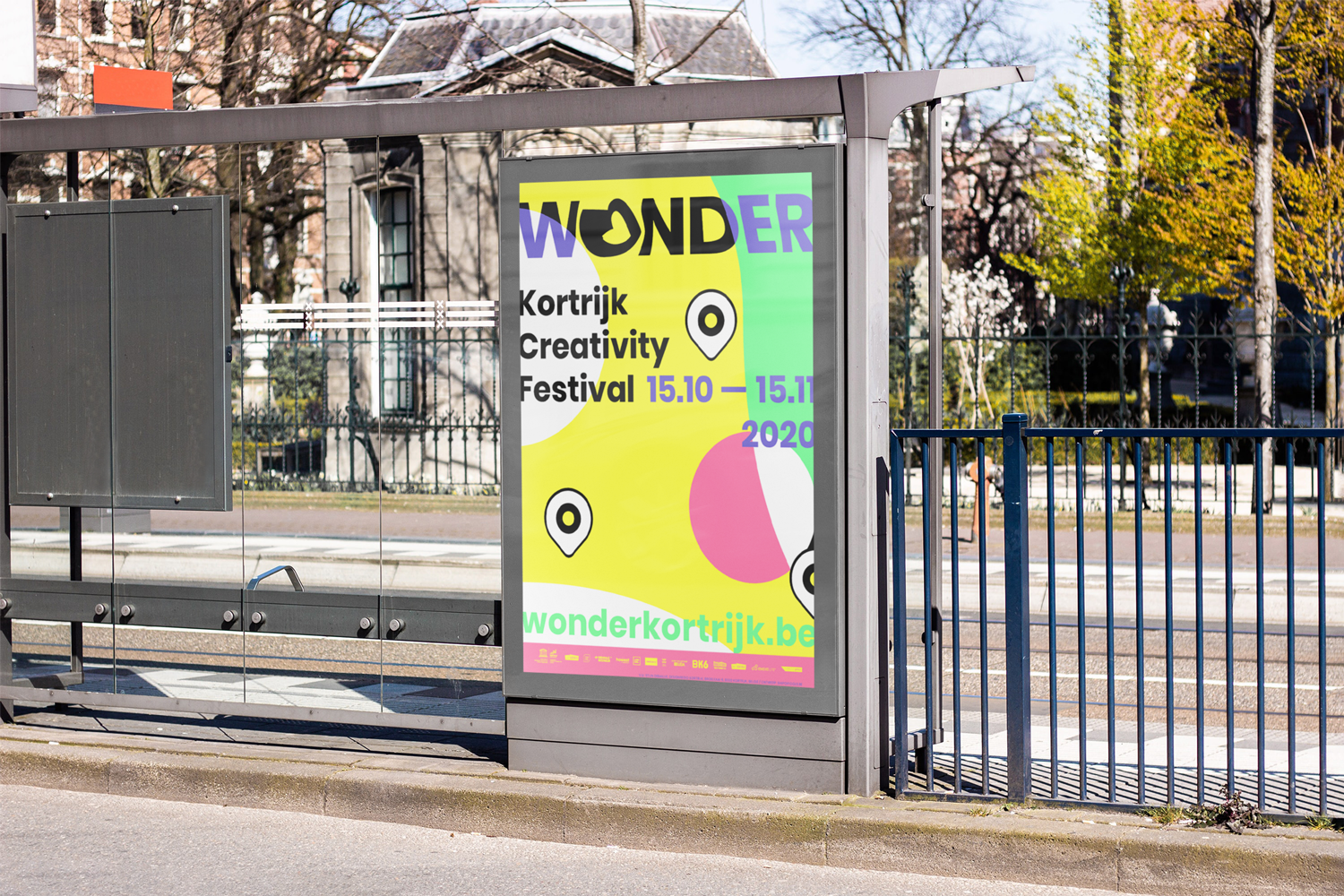
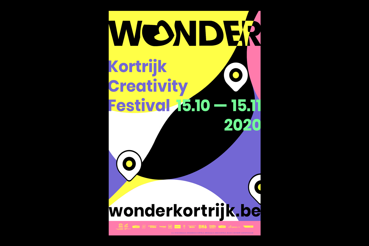
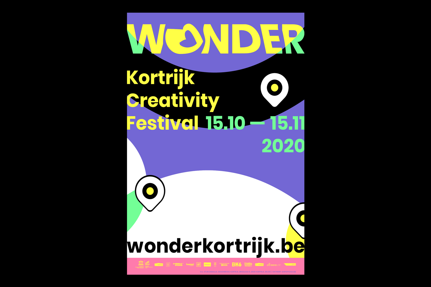
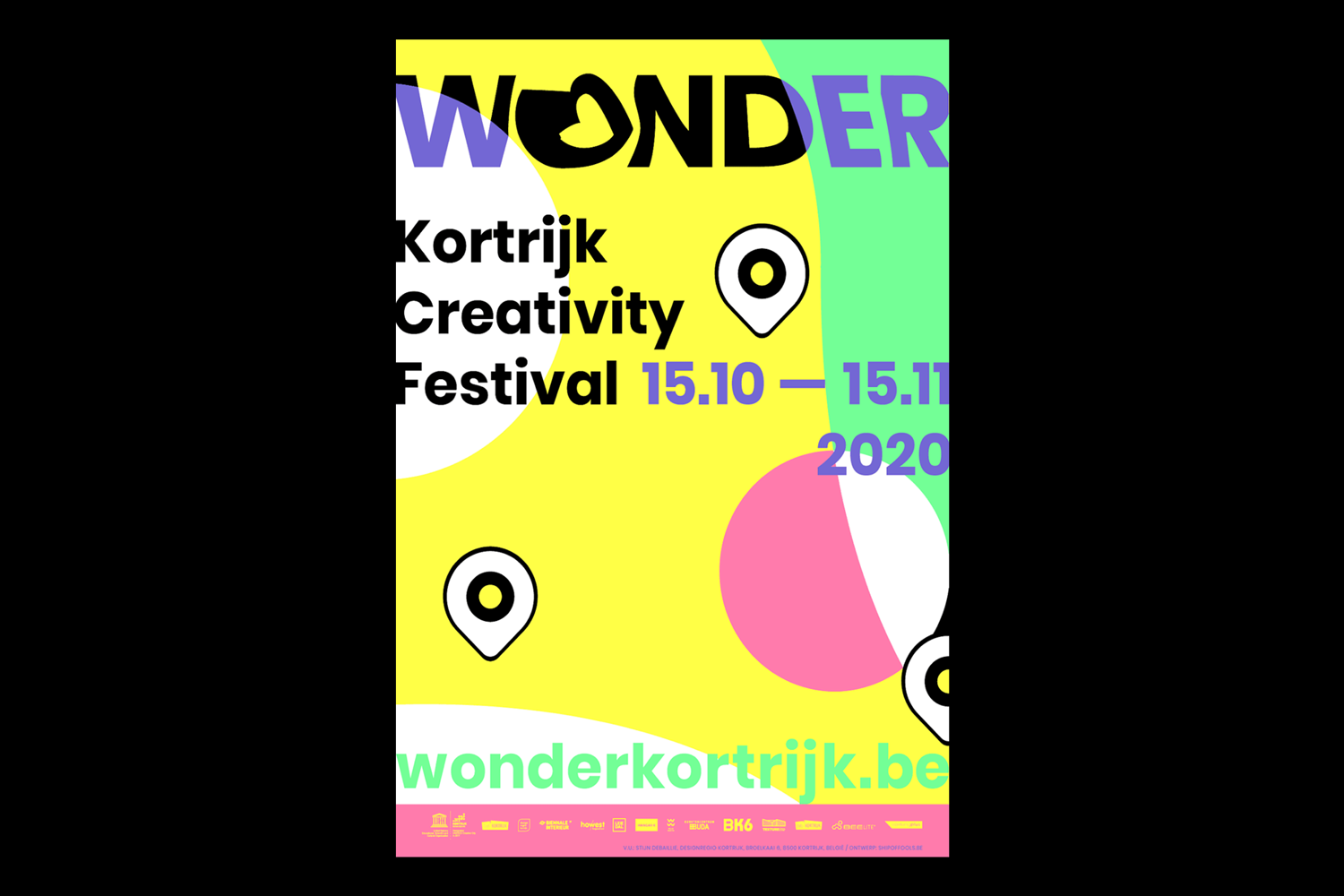
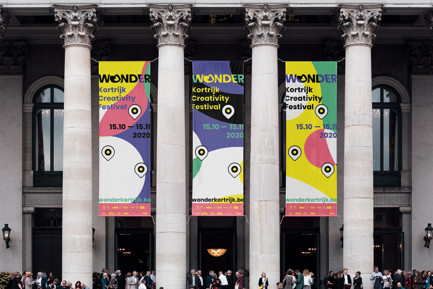
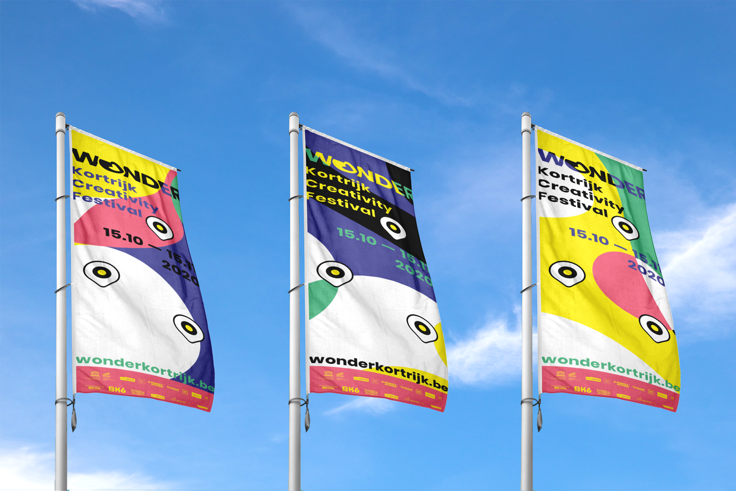
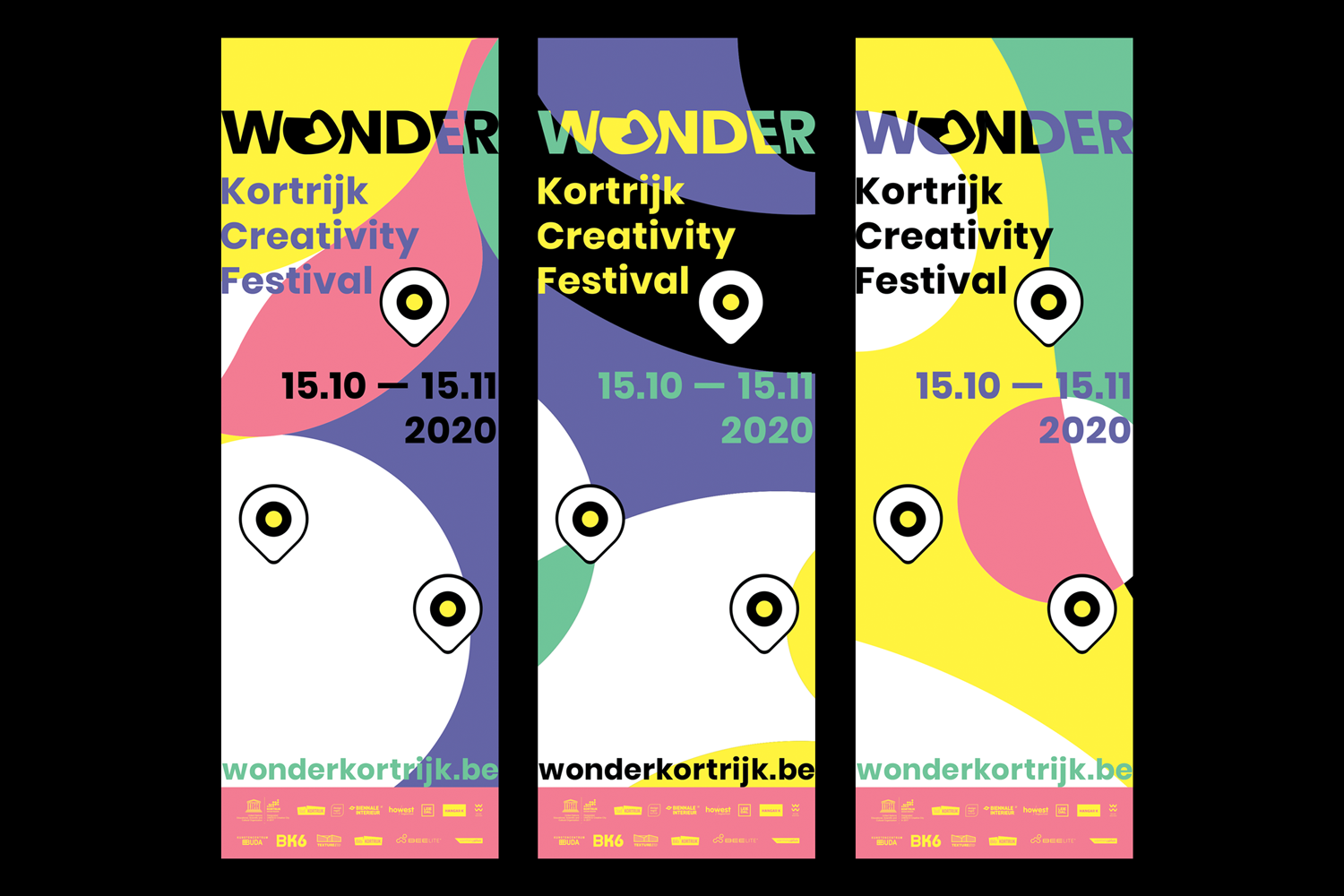
Client: Stad Kortrijk
Project: Event branding + online and offline content for ‘WONDER Kortrijk’
Tags: Advisory, Art direction & graphic design, development, content creation
-
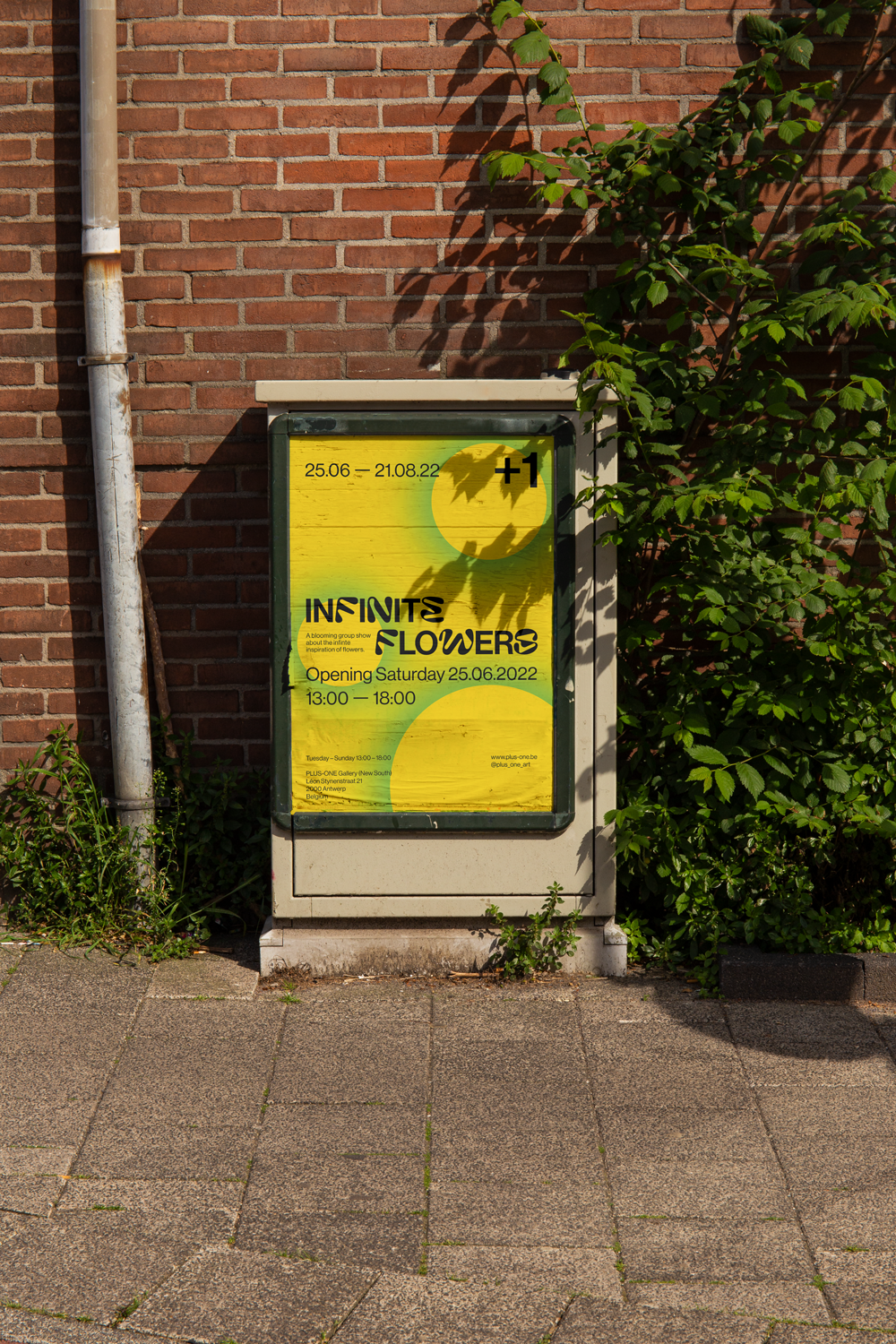
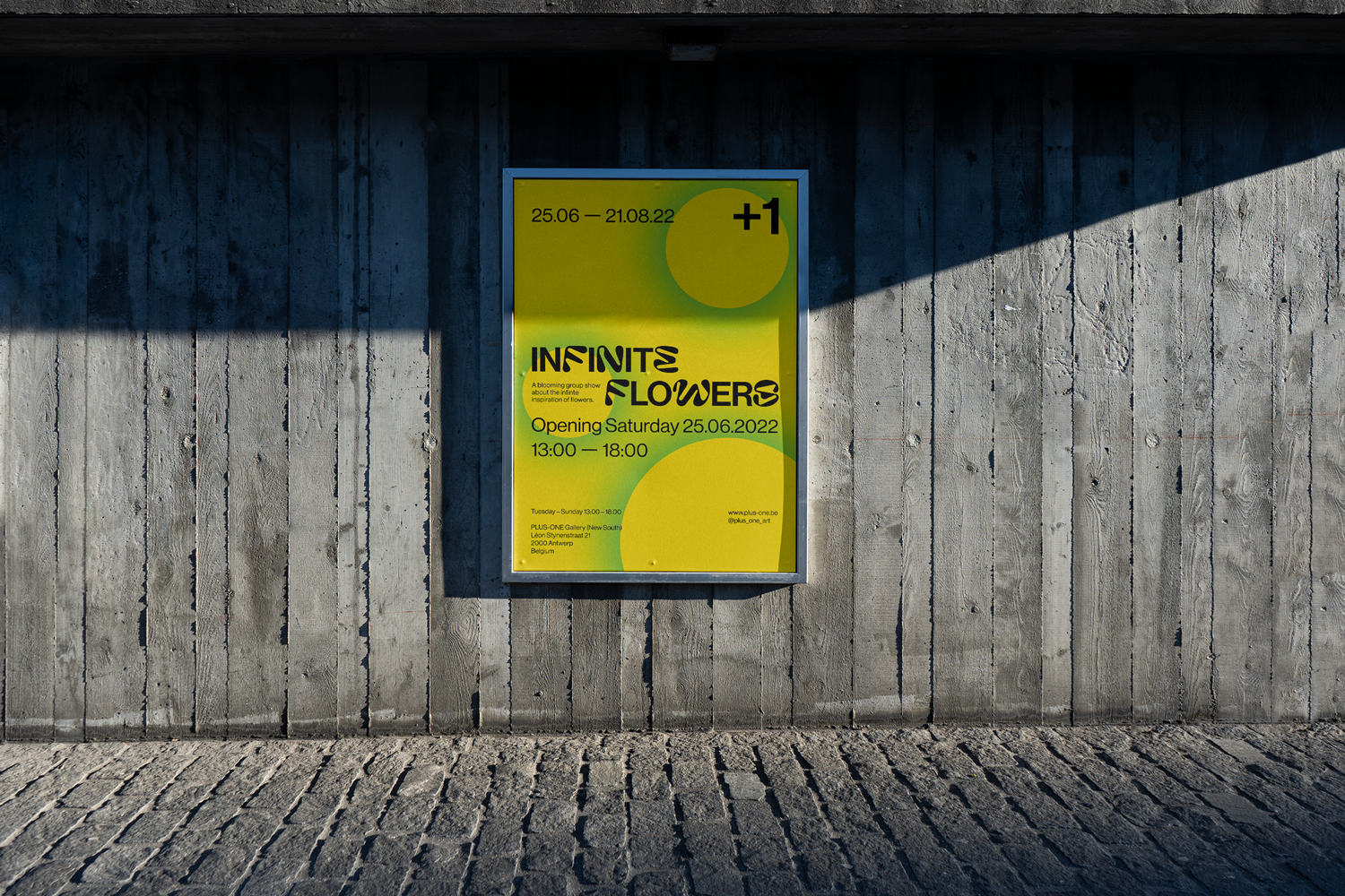
‘PFor a group exhibition it is important that the invite does not showcase one single artwork but reflects the exhibition atmosphere.
’Infinite Flowers’ was a long runner summer exhibition.
Staying true to the bold aesthetics f the gallery we used a font which is clean but also reflects the organic shapes of flowers. The background pattern is an abstraction of the corolla top view of flowers on the on hand but on te other and depicts the concept of lens flares by the sun which reinforces the summer vibes in the visual communication.
Client: PLUS-ONE Gallery
Project: Group exhibition branding ‘Infinite Flowers’
Tags: Advisory, Art direction & graphic design
-
For a group exhibition it is important that the invite does not showcase one single artwork but reflects the exhibition atmosphere.
’Infinite Flowers’ was a long runner summer exhibition.
Staying true to the bold aesthetics f the gallery we used a font which is clean but also reflects the organic shapes of flowers. The background pattern is an abstraction of the corolla top view of flowers on the on hand but on te other and depicts the concept of lens flares by the sun which reinforces the summer vibes in the visual communication.
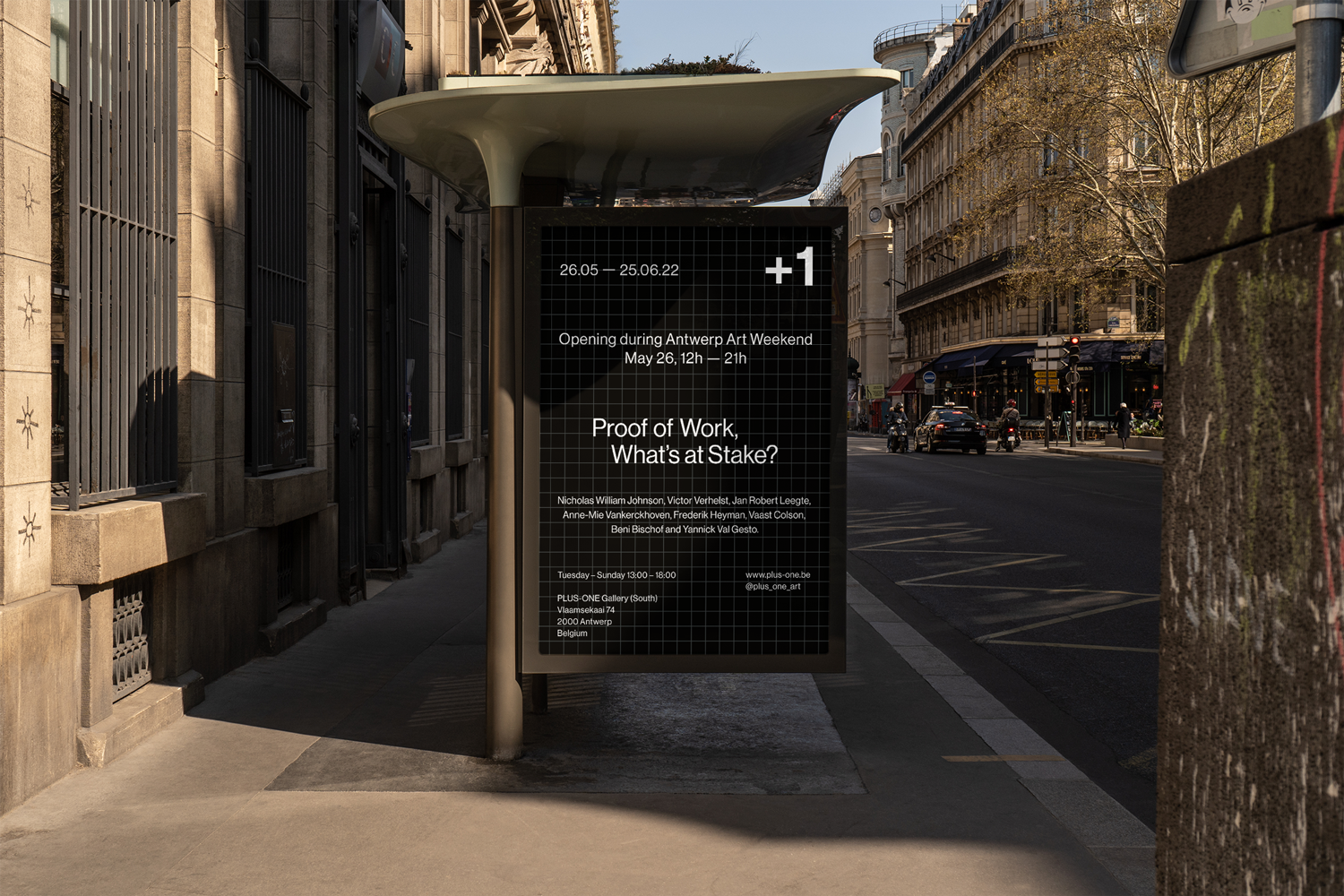
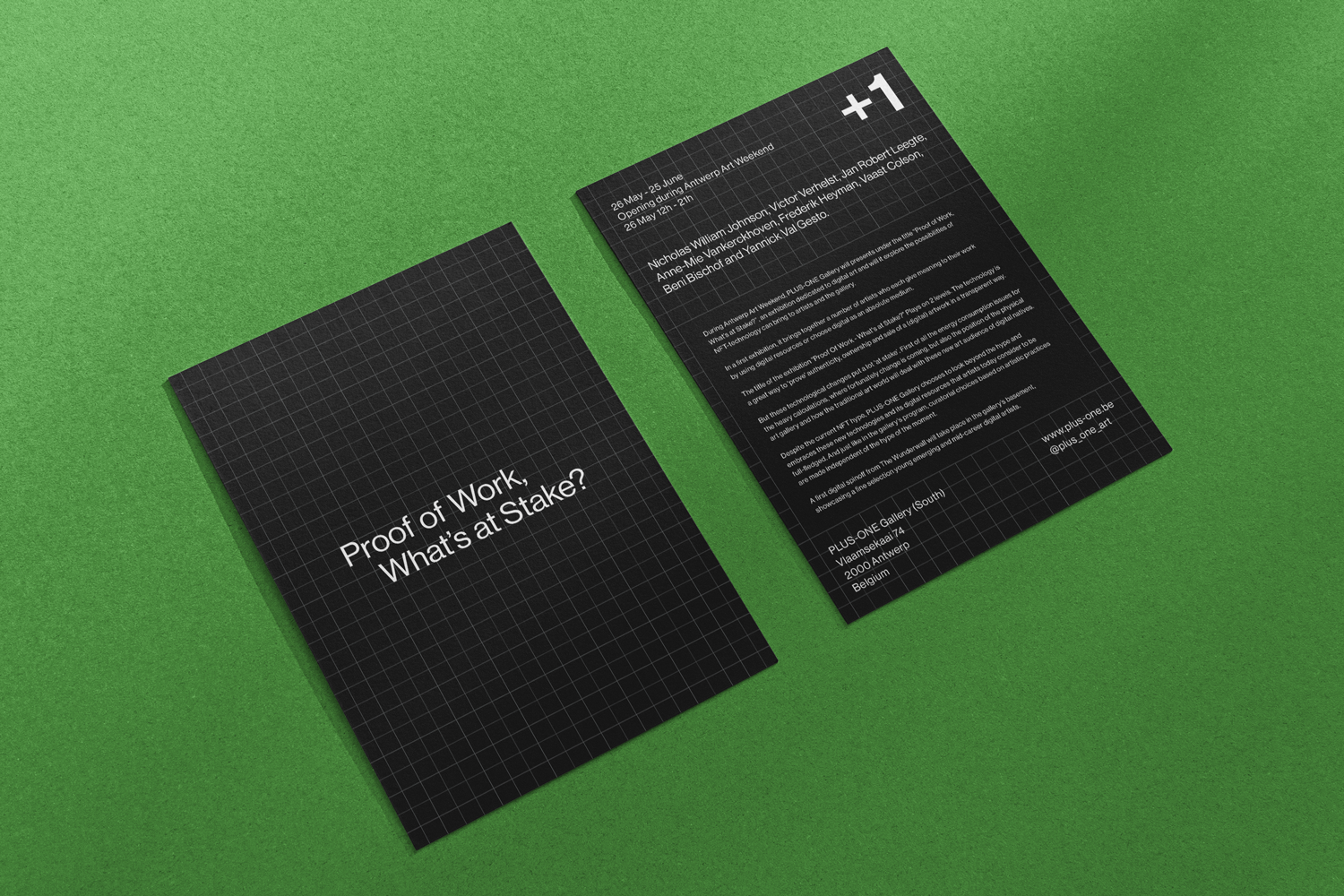
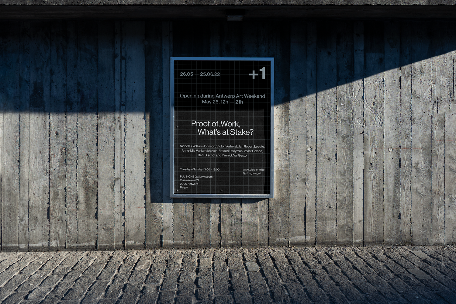
Client: PLUS-ONE Gallery
Project: Group exhibition branding ‘Proof of Work, What’s at Stake?’
Tags: Advisory, Art direction & graphic design
-
‘PFor a group exhibition it is important that the invite does not showcase one single artwork but reflects the exhibition atmosphere.
’Infinite Flowers’ was a long runner summer exhibition.
Staying true to the bold aesthetics f the gallery we used a font which is clean but also reflects the organic shapes of flowers. The background pattern is an abstraction of the corolla top view of flowers on the on hand but on te other and depicts the concept of lens flares by the sun which reinforces the summer vibes in the visual communication.